
Who is this guide for
This guide is for UK makers and independent retailers photographing products in-house. You’ll find simple, budget-friendly, and colour-reliable setups designed to help your gift bags look as good on camera as they do in your hands. (And as we know, nothing’s sadder than a soft-touch finish that looks like a cardboard box online... unless you want it to look boxy.)
Need products to shoot?
What “look true” really means
When we say "look true", we mean:
Colour fidelity
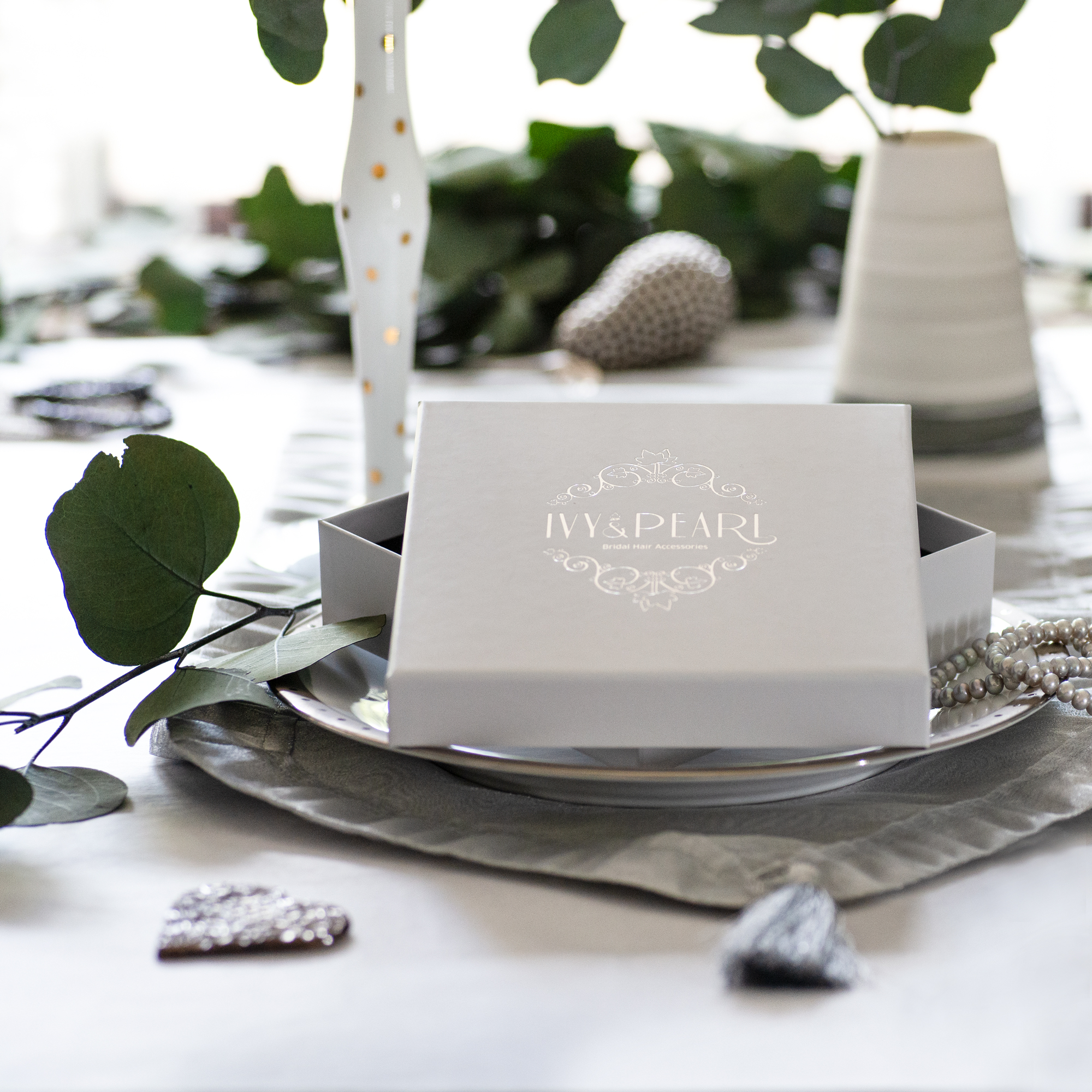
The bag you see on screen should match the real-life version closely enough that your customers don’t think you’ve sent the wrong product.
Finish realism
- Gloss should look glossy (not like a blinding white rectangle).
- Matt and soft-touch should look soft and tactile (not flat and lifeless).
- Foil and emboss should sparkle and pop in the right places.
Readable branding
Logos should appear crisp, undistorted, and glare-free, exactly as they’re printed.
Lighting recipes that just work
These setups are easy, affordable, and bag-friendly.
Gloss killers: Two-softbox cross-light (for glare control)
Use for: Gloss laminate, spot UV, shiny rope eyelets
Kit: Two softboxes (60-90 cm), tripod, CPL filter (optional)
Setup:
- Angle the bag 10-15° away from the camera.
- Place lights at 45° left or right, slightly above the bag. Feather them (aim the light edge at the bag).
- Raise lights 15-30 cm above the handle line to avoid hotspots at the top.
- Add black cards (“flags”) just out of frame to shape reflections and add contrast.
Camera settings:
ISO 100–200 · f/7.1–f/9 · 1/60–1/125 on a tripod
CPL optional. Rotate it until glare falls but colours stay rich.
Texture reveal: Single large diffuser + reflector
Perfect for matt, soft-touch, emboss and deboss, and textured papers.
Kit: Large 90-120 cm diffuser or softbox (or window + sheer curtain), white foam board reflector
Setup:
- Place one big light 90° to the side, slightly above the bag so light rakes across the surface.
- Bounce light back with foam board to soften shadows.
- Lower light angle for deeper texture; raise for smoother looks.
Camera:
ISO 100–400 · f/6.3–f/8 · adjust shutter for exposure.
No CPL needed, keep it simple.
Natural-light budget setup (window + diffusion)
Use for: Everyday product shots and fast content.
Kit: North/east-facing window, sheer curtain or tracing paper, white reflector, tripod or phone clamp.
Setup:
- Shoot on an overcast day or diffuse the window with sheer fabric.
- Place the bag 30-60 cm from the window.
- Put a reflector opposite the window to fill shadows.
- Turn off room lights to avoid yellow “potato chip packet” colour cast.
Phone tips:
Use exposure/focus lock and drop exposure by -0.3 to -0.7 EV to protect glossy highlights.
How to photograph glossy packaging (without hotspots)
Gloss is gorgeous in person... and can be infuriating on camera. Here’s how to keep it under control:
- Feather your key light so the brightest part doesn’t directly hit the front of the bag.
- Shoot slightly off-axis (bag or camera angled by 10-15°).
- Use larger, further-away lights for softer reflections.
- Add black flags to shape highlights and add definition.
- Use a CPL filter and rotate until glare drops, but don’t over-polarise foil (it’ll lose its sparkle).
Colour-accurate product photography (simple workflow)
- White balance: Start every setup with a grey card frame; set WB from that.
- Shoot RAW: (or ProRAW/HEIF on phones) for clean colour control.
- Avoid mixed light: Window + ceiling lights = muddy photos.
- Light edits only: Keep colours honest and as natural as possible.
- Stay consistent: Copy settings to all of your shots, then export sRGB for web.
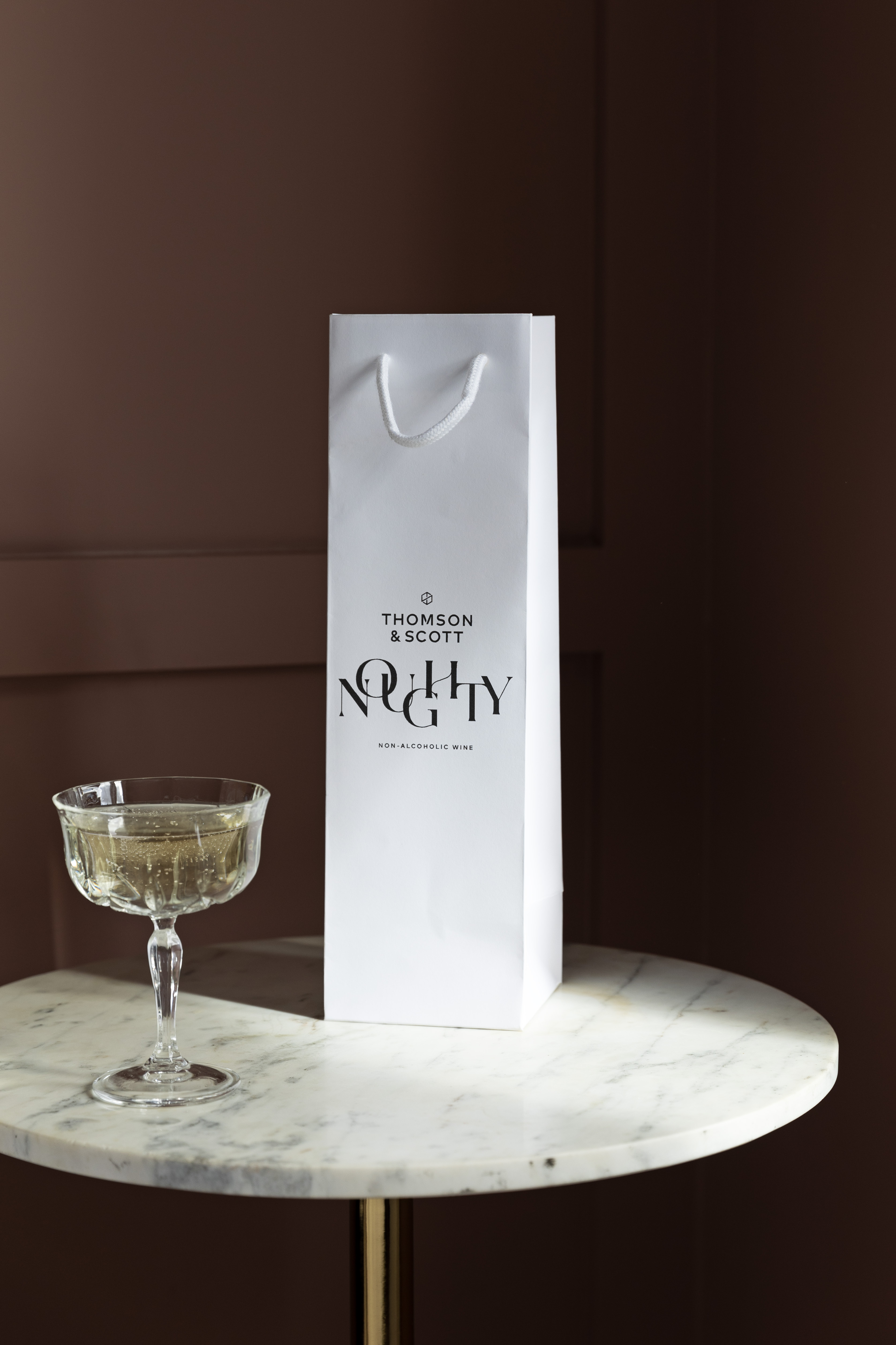
Backgrounds & props (no colour cast, no chaos)
- Choose neutral mid-tones like light grey, stone, or pale wood.
- Avoid pure white (easy to blow out) and bold colours (they reflect onto the bag).
- Props should fit the scale. Candles, ribbons, and tissue paper are safe bets.
- For seasonal themes, use one metallic accent; avoid red/green near coloured bags.
Angles & framing that flatter every gift bag
- Three-quarter hero: Camera 10-20° off-centre, lens at mid-bag height. This shows depth and keeps proportions honest.
- Top-down / flat lay: Keep handles tidy (tape them behind). Use a 50 mm-equivalent lens to avoid distortion.
- Handle management: Neaten ribbons, level knots, avoid top-third glare zones.
- Gusset reveal: Turn the bag just enough to show the side fold (but don’t overdo it!)
- Logo legibility: Keep shadows and glare off your brand mark. (Read our blog: Logo placement that reads well at a glance.)
Make finishes and textures show up
- Foil: Angle until you catch a slight highlight, then lock that shot.
- Emboss/Deboss: Use raking side-light; add fill card and bump micro-contrast slightly.
- Soft -touch: Gentle side-light + clean with a microfibre cloth first.
- Spot UV: Use one off-axis light so the glossy area pops against matt.
Consistency kit list (by budget)
Start (£150 and under)
- 2× foam boards (white + black)
- Sheer curtain/diffuser
- Basic tripod / phone clamp
- Grey card
- Microfibre cloth
- Gaffer tape (the real MVP)
Grow (£350-£600)
- 2× 60-80cm LED softboxes
- 5-in-1 reflector
- CPL filter (58-67mm)
- Remote trigger
Pro-ish (£900+)
- 2× 90-120cm soft sources
- Boom arm
- Colour card (X-Rite etc.)
- Tethering cable
- Polarising film for lights
Phone vs camera: What’s “good enough”?
Phones can absolutely do it, especially for web. Just:
- Lock focus/exposure on the logo.
- Drop exposure slightly (−0.3 to −0.7 EV).
- Use RAW if possible.
- Stabilise with a tripod + 2-sec timer.

Simple shot list & naming system (your future self will thank you)
Angles per bag:
- Three-quarter hero.
- Front straight-on.
- Detail shot (foil/emboss/texture).
- Open/top-down if relevant.
Crops:
- 1:1 for social.
- 4:5 or 3:2 for product pages.
- 16:9 for banners.
File naming:
bagname_colour_finish_angle_YYYYMMDD.ext
Example:
Soho_Black_SoftTouch_34H_20251126.jpg
Need products to shoot?
Want to create an unboxing moment with gift bags?


